Modals
Default Modal
A default modal Example.
<!-- Default Modals -->
let modal_standard = false;
const tog_standard = () => (modal_standard = !modal_standard);
<Modal
id="myModal"
isOpen={modal_standard}
toggle={() => {
tog_standard();
}}
>
<ModalHeader
class="modal-title"
id="myModalLabel"
toggle={() => {
tog_standard();
}}
>
Modal Heading
</ModalHeader>
<ModalBody>
<h5 class="fs-15">Overflowing text to show scroll behavior</h5>
<p class="text-muted">
One morning, when Gregor Samsa woke from troubled dreams, he found
himself transformed in his bed into a horrible vermin. He lay on his
armour-like back, and if he lifted his head a little he could see
his brown belly, slightly domed and divided by arches into stiff
sections.
</p>
<p class="text-muted">
The bedding was hardly able to cover it and seemed ready to slide
off any moment. His many legs, pitifully thin compared with the size
of the rest of him, waved about helplessly as he looked. "What's
happened to me?" he thought.
</p>
<p class="text-muted">
It wasn't a dream. His room, a proper human room although a little
too small, lay peacefully between its four familiar walls.
</p>
</ModalBody>
<div class="modal-footer">
<Button
color="light"
on:click={() => {
tog_standard();
}}
>
Close
</Button>
<Button color="primary">Save changes</Button>
</div>
</Modal>
<Button color="primary" on:click={tog_standard}>Standard Modal</Button>
Vertically Centered Modal
Use modal-dialog-centered
class to show
vertically center the modal.
<!-- Vertically Centered -->
let modal_center = false;
const tog_center = () => (modal_center = !modal_center);
<Modal
isOpen={modal_center}
toggle={() => {
tog_center();
}}
centered
>
<ModalHeader class="modal-title" />
<ModalBody class="text-center p-5">
<lord-icon
src="//cdn.lordicon.com/hrqwmuhr.json"
trigger="loop"
colors="primary:#121331,secondary:#08a88a"
style="width:120px;height:120px"
/>
<div class="mt-4">
<h4 class="mb-3">Oops something went wrong!</h4>
<p class="text-muted mb-4">
The transfer was not successfully received by us. the email of
the recipient wasn't correct.
</p>
<div class="hstack gap-2 justify-content-center">
<Button color="light" on:click={tog_center}>Close</Button>
<Link href={null} class="btn btn-danger">Try Again</Link>
</div>
</div>
</ModalBody>
</Modal>
<Button color="primary" on:click={tog_center}>Center Modal</Button>
Grids in Modals
<!-- Grids in modals -->
let modal_grid = false;
const tog_grid = () => (modal_grid = !modal_grid);
<Modal
isOpen={modal_grid}
toggle={() => {
tog_grid();
}}
>
<ModalHeader
class="modal-title"
toggle={() => {
tog_grid();
}}
>
Grid Modals
</ModalHeader>
<ModalBody>
<form action="#">
<div class="row g-3">
<Col xxl={6}>
<div>
<Label for="firstName" class="form-label">First Name</Label
>
<Input
type="text"
class="form-control"
id="firstName"
placeholder="Enter firstname"
/>
</div>
</Col>
<Col xxl={6}>
<div>
<Label for="lastName" class="form-label">Last Name</Label
>
<Input
type="text"
class="form-control"
id="lastName"
placeholder="Enter lastname"
/>
</div>
</Col>
<Col lg={12}>
<Label class="form-label">Gender</Label>
<div>
<div class="form-check form-check-inline">
<input
class="form-check-input"
type="radio"
name="inlineRadioOptions"
id="inlineRadio1"
value="option1"
/>
<Label class="form-check-label" for="inlineRadio1"
>Male</Label>
</div>
<div class="form-check form-check-inline">
<input
class="form-check-input"
type="radio"
name="inlineRadioOptions"
id="inlineRadio2"
value="option2"
/>
<Label class="form-check-label" for="inlineRadio2"
>Female</Label>
</div>
<div class="form-check form-check-inline">
<input
class="form-check-input"
type="radio"
name="inlineRadioOptions"
id="inlineRadio3"
value="option3"
/>
<Label class="form-check-label" for="inlineRadio3"
>Others</Label>
</div>
</div>
</Col>
<Col xxl={6}>
<Label for="emailInput" class="form-label">Email</Label>
<Input
type="email"
class="form-control"
id="emailInput"
placeholder="Enter your email"
/>
</Col>
<Col xxl={6}>
<Label for="passwordInput" class="form-label"
>Password</Label>
<Input
type="password"
class="form-control"
id="passwordInput"
value="451326546"
readOnly
/>
</Col>
<Col lg={12}>
<div class="hstack gap-2 justify-content-end">
<Button color="light" on:click={tog_grid}>Close</Button>
<Button color="primary">Submit</Button>
</div>
</Col>
</div>
</form>
</ModalBody>
</Modal>
<Button color="primary" on:click={tog_grid}>Launch Demo Modal</Button>
Static Backdrop Modal
<!-- Static Backdrop -->
<Modal
isOpen={modal_backdrop}
toggle={() => {
tog_backdrop();
}}
backdrop={"static"}
id="staticBackdrop"
centered
>
<ModalHeader
class="modal-title"
id="staticBackdropLabel"
toggle={() => {
tog_backdrop();
}}
>
Modal title
</ModalHeader>
<ModalBody class="text-center p-5">
<lord-icon
src="//cdn.lordicon.com/lupuorrc.json"
trigger="loop"
colors="primary:#121331,secondary:#08a88a"
style="width: 120px; height: 120px"
/>
<div class="mt-4">
<h4 class="mb-3">You've made it!</h4>
<p class="text-muted mb-4">
The transfer was not successfully received by us. the email of
the recipient wasn't correct.
</p>
<div class="hstack gap-2 justify-content-center">
<Link
href={null}
class="btn btn-link link-success fw-medium"
on:click={tog_backdrop}><i class="ri-close-line me-1 align-middle" /> Close</Link
>
<Link href={null} class="btn btn-success" on:click={tog_backdrop}>Completed</Link
>
</div>
</div>
</ModalBody>
</Modal>
<Button color="primary" on:click={tog_backdrop}>Static Backdrop Modal</Button>
Toggle Between Modal
<!-- Default List -->
let modal_togFirst = false;
const tog_togFirst = () => (modal_togFirst = !modal_togFirst);
<Modal
isOpen={modal_togFirst}
toggle={() => {
tog_togFirst();
}}
id="firstmodal"
centered
>
<ModalHeader
class="modal-title"
id="exampleModalToggleLabel"
toggle={() => {
tog_togFirst();
}}
>
Modal 1
</ModalHeader>
<ModalBody class="text-center p-5">
<lord-icon
src="//cdn.lordicon.com/tdrtiskw.json"
trigger="loop"
colors="primary:#f7b84b,secondary:#405189"
style="width: 130px; height: 130px"
/>
<div class="mt-4 pt-4">
<h4>Uh oh, something went wrong!</h4>
<p class="text-muted">
The transfer was not successfully received by us. the email of
the recipient wasn't correct.
</p>
<Button
color="warning"
on:click={() => {
tog_togSecond();
tog_togFirst(false);
}}
>
Continue
</Button>
</div>
</ModalBody>
</Modal>
<Button color="primary" on:click={tog_togFirst}>Open First Modal</Button>
Tooltips and Popovers
<!-- Tooltips and Popovers -->
let modal_tooltip = false;
const tog_tooltip = () => (modal_tooltip = !modal_tooltip);
<Modal
isOpen={modal_togSecond}
toggle={() => {
tog_togSecond();
}}
id="secondmodal"
centered
>
<ModalHeader
class="modal-title"
id="exampleModalToggleLabel2"
toggle={() => {
tog_togSecond();
}}
>
Modal 2
</ModalHeader>
<ModalBody class="text-center p-5">
<lord-icon
src="//cdn.lordicon.com/zpxybbhl.json"
trigger="loop"
colors="primary:#405189,secondary:#0ab39c"
style="width: 150px; height: 150px"
/>
<div class="mt-4 pt-3">
<h4 class="mb-3">Follow-Up Email</h4>
<p class="text-muted mb-4">
Hide this modal and show the first with the button below
Automatically Send your invitees a follow -Up email.
</p>
<div class="hstack gap-2 justify-content-center">
<Button
color="danger"
on:click={() => {
tog_togFirst();
tog_togSecond(false);
}}
>
Back to First
</Button>
<Button color="light" on:click={tog_togSecond}>Close</Button>
</div>
</div>
</ModalBody>
</Modal>
<Button color="primary" on:click={tog_tooltip}>Launch Demo Modal</Button>
Scrollable Modal
<!-- Scrollable Modal -->
let modal_scroll = false;
const tog_scroll = () => (modal_scroll = !modal_scroll);
<Modal
isOpen={modal_scroll}
toggle={() => {
tog_scroll();
}}
scrollable={true}
id="exampleModalScrollable"
>
<ModalHeader
class="modal-title"
id="exampleModalScrollableTitle"
toggle={() => {
tog_scroll();
}}
>
Scrollable modal
</ModalHeader>
<ModalBody>
<h6 class="fs-15">Give your text a good structure</h6>
<div class="d-flex">
<div class="flex-shrink-0">
<i class="ri-checkbox-circle-fill text-success" />
</div>
<div class="flex-grow-1 ms-2">
<p class="text-muted mb-0">
Raw denim you probably haven't heard of them jean shorts
Austin. Nesciunt tofu stumptown aliqua, retro synth master
cleanse.
</p>
</div>
</div>
<div class="d-flex mt-2">
<div class="flex-shrink-0">
<i class="ri-checkbox-circle-fill text-success" />
</div>
<div class="flex-grow-1 ms-2 ">
<p class="text-muted mb-0">
Too much or too little spacing, as in the example below, can
make things unpleasant for the reader. The goal is to make
your text as comfortable to read as possible.
</p>
</div>
</div>
<div class="d-flex mt-2">
<div class="flex-shrink-0">
<i class="ri-checkbox-circle-fill text-success" />
</div>
<div class="flex-grow-1 ms-2 ">
<p class="text-muted mb-0">
In some designs, you might adjust your tracking to create a
certain artistic effect. It can also help you fix fonts that
are poorly spaced to begin with.
</p>
</div>
</div>
<div class="d-flex mt-2">
<div class="flex-shrink-0">
<i class="ri-checkbox-circle-fill text-success" />
</div>
<div class="flex-grow-1 ms-2 ">
<p class="text-muted mb-0">
For that very reason, I went on a quest and spoke to many
different professional graphic designers and asked them what
graphic design tips they live.
</p>
</div>
</div>
<div class="d-flex mt-2">
<div class="flex-shrink-0">
<i class="ri-checkbox-circle-fill text-success" />
</div>
<div class="flex-grow-1 ms-2 ">
<p class="text-muted mb-0">
You've probably heard that opposites attract. The same is
true for fonts. Don't be afraid to combine font styles that
are different but complementary, like sans serif with serif,
short with tall, or decorative with simple. Qui photo booth
letterpress, commodo enim craft beer mlkshk aliquip jean
shorts ullamco ad vinyl cillum PBR.
</p>
</div>
</div>
<div class="d-flex mt-2">
<div class="flex-shrink-0">
<i class="ri-checkbox-circle-fill text-success" />
</div>
<div class="flex-grow-1 ms-2 ">
<p class="text-muted mb-0">
For that very reason, I went on a quest and spoke to many
different professional graphic designers and asked them what
graphic design tips they live.
</p>
</div>
</div>
<h6 class="fs-16 my-3">Graphic Design</h6>
<div class="d-flex mt-2">
<div class="flex-shrink-0">
<i class="ri-checkbox-circle-fill text-success" />
</div>
<div class="flex-grow-1 ms-2 ">
<p class="text-muted mb-0">
Opposites attract, and that’s a fact. It’s in our nature to
be interested in the unusual, and that’s why using
contrasting colors in Graphic Design is a must. It’s
eye-catching, it makes a statement, it’s impressive graphic
design. Increase or decrease the letter spacing depending.
</p>
</div>
</div>
<div class="d-flex mt-2">
<div class="flex-shrink-0">
<i class="ri-checkbox-circle-fill text-success" />
</div>
<div class="flex-grow-1 ms-2 ">
<p class="text-muted mb-0">
Trust fund seitan letterpress, keytar raw denim keffiyeh
etsy art party before they sold out master cleanse
gluten-free squid scenester freegan cosby sweater.
</p>
</div>
</div>
<div class="d-flex mt-2">
<div class="flex-shrink-0">
<i class="ri-checkbox-circle-fill text-success" />
</div>
<div class="flex-grow-1 ms-2 ">
<p class="text-muted mb-0">
Just like in the image where we talked about using multiple
fonts, you can see that the background in this graphic
design is blurred. Whenever you put text on top of an image,
it’s important that your viewers can understand.
</p>
</div>
</div>
<div class="d-flex mt-2">
<div class="flex-shrink-0">
<i class="ri-checkbox-circle-fill text-success" />
</div>
<div class="flex-grow-1 ms-2 ">
<p class="text-muted mb-0">
Keytar raw denim keffiyeh etsy art party before they sold
out master cleanse gluten-free squid scenester freegan cosby
sweater.
</p>
</div>
</div>
</ModalBody>
<div class="modal-footer">
<Button color="light" on:click={tog_scroll}>Close</Button>
<Button color="primary">Save changes</Button>
</div>
</Modal>
<Button color="primary" on:click={tog_scroll}>Scrollable Modal</Button>
Varying Modal Content
<!-- Varying Modal Content -->
let modal_varying1 = false;
const tog_varying1 = () => (modal_varying1 = !modal_varying1);
let modal_varying2 = false;
const tog_varying2 = () => (modal_varying2 = !modal_varying2);
let modal_varying3 = false;
const tog_varying3 = () => (modal_varying3 = !modal_varying3);
<Button
color="primary"
on:click={tog_varying1}
>Open Modal for Mary</Button
>
<Button
color="primary"
on:click={tog_varying2}
>Open Modal for Jennifer</Button
>
<Button
color="primary"
on:click={tog_varying3}
>Open Modal for Roderick</Button
>
Optional Sizes
Use modal-fullscreen
,
modal-xl
, modal-lg
, or
modal-sm
class to modal-dialog class to
set different size modal respectively.
<!-- Optional Modal Sizes -->
let modal_fullscreen = false;
const tog_fullscreen = () => (modal_fullscreen = !modal_fullscreen);
let modal_xlarge = false;
const tog_xlarge = () => (modal_xlarge = !modal_xlarge);
let modal_large = false;
const tog_large = () => (modal_large = !modal_large);
let modal_small = false;
const tog_small = () => (modal_small = !modal_small);
<Modal
size="xl"
isOpen={modal_fullscreen}
toggle={() => {
tog_fullscreen();
}}
class="modal-fullscreen"
id="exampleModalFullscreen"
>
<ModalHeader
class="modal-title"
id="exampleModalFullscreenLabel"
toggle={() => {
tog_fullscreen();
}}
>
Fullscreen Modal Heading
</ModalHeader>
<ModalBody>
<h6 class="fs-15">Give your text a good structure</h6>
<div class="d-flex">
<div class="flex-shrink-0">
<i class="ri-checkbox-circle-fill text-success" />
</div>
<div class="flex-grow-1 ms-2">
<p class="text-muted mb-0">
Raw denim you probably haven't heard of them jean shorts
Austin. Nesciunt tofu stumptown aliqua, retro synth master
cleanse.
</p>
</div>
</div>
<div class="d-flex mt-2">
<div class="flex-shrink-0">
<i class="ri-checkbox-circle-fill text-success" />
</div>
<div class="flex-grow-1 ms-2 ">
<p class="text-muted mb-0">
Too much or too little spacing, as in the example below, can
make things unpleasant for the reader. The goal is to make
your text as comfortable to read as possible.
</p>
</div>
</div>
<div class="d-flex mt-2">
<div class="flex-shrink-0">
<i class="ri-checkbox-circle-fill text-success" />
</div>
<div class="flex-grow-1 ms-2 ">
<p class="text-muted mb-0">
In some designs, you might adjust your tracking to create a
certain artistic effect. It can also help you fix fonts that
are poorly spaced to begin with.
</p>
</div>
</div>
<div class="d-flex mt-2">
<div class="flex-shrink-0">
<i class="ri-checkbox-circle-fill text-success" />
</div>
<div class="flex-grow-1 ms-2 ">
<p class="text-muted mb-0">
For that very reason, I went on a quest and spoke to many
different professional graphic designers and asked them what
graphic design tips they live.
</p>
</div>
</div>
<div class="d-flex mt-2">
<div class="flex-shrink-0">
<i class="ri-checkbox-circle-fill text-success" />
</div>
<div class="flex-grow-1 ms-2 ">
<p class="text-muted mb-0">
You've probably heard that opposites attract. The same is
true for fonts. Don't be afraid to combine font styles that
are different but complementary, like sans serif with serif,
short with tall, or decorative with simple. Qui photo booth
letterpress, commodo enim craft beer mlkshk aliquip jean
shorts ullamco ad vinyl cillum PBR.
</p>
</div>
</div>
<div class="d-flex mt-2">
<div class="flex-shrink-0">
<i class="ri-checkbox-circle-fill text-success" />
</div>
<div class="flex-grow-1 ms-2 ">
<p class="text-muted mb-0">
For that very reason, I went on a quest and spoke to many
different professional graphic designers and asked them what
graphic design tips they live.
</p>
</div>
</div>
<h6 class="fs-16 my-3">Graphic Design</h6>
<div class="d-flex mt-2">
<div class="flex-shrink-0">
<i class="ri-checkbox-circle-fill text-success" />
</div>
<div class="flex-grow-1 ms-2 ">
<p class="text-muted mb-0">
Opposites attract, and that’s a fact. It’s in our nature to
be interested in the unusual, and that’s why using
contrasting colors in Graphic Design is a must. It’s
eye-catching, it makes a statement, it’s impressive graphic
design. Increase or decrease the letter spacing depending.
</p>
</div>
</div>
<div class="d-flex mt-2">
<div class="flex-shrink-0">
<i class="ri-checkbox-circle-fill text-success" />
</div>
<div class="flex-grow-1 ms-2 ">
<p class="text-muted mb-0">
Trust fund seitan letterpress, keytar raw denim keffiyeh
etsy art party before they sold out master cleanse
gluten-free squid scenester freegan cosby sweater.
</p>
</div>
</div>
<div class="d-flex mt-2">
<div class="flex-shrink-0">
<i class="ri-checkbox-circle-fill text-success" />
</div>
<div class="flex-grow-1 ms-2 ">
<p class="text-muted mb-0">
Just like in the image where we talked about using multiple
fonts, you can see that the background in this graphic
design is blurred. Whenever you put text on top of an image,
it’s important that your viewers can understand.
</p>
</div>
</div>
<div class="d-flex mt-2">
<div class="flex-shrink-0">
<i class="ri-checkbox-circle-fill text-success" />
</div>
<div class="flex-grow-1 ms-2 ">
<p class="text-muted mb-0">
Keytar raw denim keffiyeh etsy art party before they sold
out master cleanse gluten-free squid scenester freegan cosby
sweater.
</p>
</div>
</div>
</ModalBody>
<div class="modal-footer">
<Link
href={null}
color="light"
on:click={() => {
tog_fullscreen();
}}
class="btn btn-link link-success fw-medium"
><i class="ri-close-line me-1 align-middle" />
Close
</Link>
<Button color="primary" class="btn btn-primary ">Save changes</Button>
</div>
</Modal>
<Modal
size="xl"
isOpen={modal_xlarge}
toggle={() => {
tog_xlarge();
}}
>
<ModalHeader
class="modal-title"
id="myExtraLargeModalLabel"
toggle={() => {
tog_xlarge();
}}
>
Extra large modal
</ModalHeader>
<ModalBody>
<h6 class="fs-15">Give your text a good structure</h6>
<div class="d-flex">
<div class="flex-shrink-0">
<i class="ri-checkbox-circle-fill text-success" />
</div>
<div class="flex-grow-1 ms-2">
<p class="text-muted mb-0">
Raw denim you probably haven't heard of them jean shorts
Austin. Nesciunt tofu stumptown aliqua, retro synth master
cleanse.
</p>
</div>
</div>
<div class="d-flex mt-2">
<div class="flex-shrink-0">
<i class="ri-checkbox-circle-fill text-success" />
</div>
<div class="flex-grow-1 ms-2 ">
<p class="text-muted mb-0">
Too much or too little spacing, as in the example below, can
make things unpleasant for the reader. The goal is to make
your text as comfortable to read as possible.
</p>
</div>
</div>
<div class="d-flex mt-2">
<div class="flex-shrink-0">
<i class="ri-checkbox-circle-fill text-success" />
</div>
<div class="flex-grow-1 ms-2 ">
<p class="text-muted mb-0">
In some designs, you might adjust your tracking to create a
certain artistic effect. It can also help you fix fonts that
are poorly spaced to begin with.
</p>
</div>
</div>
<div class="d-flex mt-2">
<div class="flex-shrink-0">
<i class="ri-checkbox-circle-fill text-success" />
</div>
<div class="flex-grow-1 ms-2 ">
<p class="text-muted mb-0">
For that very reason, I went on a quest and spoke to many
different professional graphic designers and asked them what
graphic design tips they live.
</p>
</div>
</div>
<div class="d-flex mt-2">
<div class="flex-shrink-0">
<i class="ri-checkbox-circle-fill text-success" />
</div>
<div class="flex-grow-1 ms-2 ">
<p class="text-muted mb-0">
You've probably heard that opposites attract. The same is
true for fonts. Don't be afraid to combine font styles that
are different but complementary, like sans serif with serif,
short with tall, or decorative with simple. Qui photo booth
letterpress, commodo enim craft beer mlkshk aliquip jean
shorts ullamco ad vinyl cillum PBR.
</p>
</div>
</div>
<div class="d-flex mt-2">
<div class="flex-shrink-0">
<i class="ri-checkbox-circle-fill text-success" />
</div>
<div class="flex-grow-1 ms-2 ">
<p class="text-muted mb-0">
For that very reason, I went on a quest and spoke to many
different professional graphic designers and asked them what
graphic design tips they live.
</p>
</div>
</div>
<h6 class="fs-16 my-3">Graphic Design</h6>
<div class="d-flex mt-2">
<div class="flex-shrink-0">
<i class="ri-checkbox-circle-fill text-success" />
</div>
<div class="flex-grow-1 ms-2 ">
<p class="text-muted mb-0">
Opposites attract, and that’s a fact. It’s in our nature to
be interested in the unusual, and that’s why using
contrasting colors in Graphic Design is a must. It’s
eye-catching, it makes a statement, it’s impressive graphic
design. Increase or decrease the letter spacing depending.
</p>
</div>
</div>
<div class="d-flex mt-2">
<div class="flex-shrink-0">
<i class="ri-checkbox-circle-fill text-success" />
</div>
<div class="flex-grow-1 ms-2 ">
<p class="text-muted mb-0">
Trust fund seitan letterpress, keytar raw denim keffiyeh
etsy art party before they sold out master cleanse
gluten-free squid scenester freegan cosby sweater.
</p>
</div>
</div>
<div class="d-flex mt-2">
<div class="flex-shrink-0">
<i class="ri-checkbox-circle-fill text-success" />
</div>
<div class="flex-grow-1 ms-2 ">
<p class="text-muted mb-0">
Just like in the image where we talked about using multiple
fonts, you can see that the background in this graphic
design is blurred. Whenever you put text on top of an image,
it’s important that your viewers can understand.
</p>
</div>
</div>
<div class="d-flex mt-2">
<div class="flex-shrink-0">
<i class="ri-checkbox-circle-fill text-success" />
</div>
<div class="flex-grow-1 ms-2 ">
<p class="text-muted mb-0">
Keytar raw denim keffiyeh etsy art party before they sold
out master cleanse gluten-free squid scenester freegan cosby
sweater.
</p>
</div>
</div>
</ModalBody>
<div class="modal-footer">
<Link
href={null}
class="btn btn-link link-success fw-medium"
on:click={tog_xlarge}
><i class="ri-close-line me-1 align-middle" /> Close</Link
>
<Button color="primary">Save changes</Button>
</div>
</Modal>
<Modal
size="lg"
isOpen={modal_large}
toggle={() => {
tog_large();
}}
>
<ModalHeader
class="modal-title"
id="myLargeModalLabel"
toggle={() => {
tog_large();
}}
>
Large Modal
</ModalHeader>
<ModalBody>
<h6 class="fs-15">Give your text a good structure</h6>
<div class="d-flex">
<div class="flex-shrink-0">
<i class="ri-checkbox-circle-fill text-success" />
</div>
<div class="flex-grow-1 ms-2">
<p class="text-muted mb-0">
Raw denim you probably haven't heard of them jean shorts
Austin. Nesciunt tofu stumptown aliqua, retro synth master
cleanse.
</p>
</div>
</div>
<div class="d-flex mt-2">
<div class="flex-shrink-0">
<i class="ri-checkbox-circle-fill text-success" />
</div>
<div class="flex-grow-1 ms-2 ">
<p class="text-muted mb-0">
Too much or too little spacing, as in the example below, can
make things unpleasant for the reader. The goal is to make
your text as comfortable to read as possible.
</p>
</div>
</div>
<div class="d-flex mt-2">
<div class="flex-shrink-0">
<i class="ri-checkbox-circle-fill text-success" />
</div>
<div class="flex-grow-1 ms-2 ">
<p class="text-muted mb-0">
In some designs, you might adjust your tracking to create a
certain artistic effect. It can also help you fix fonts that
are poorly spaced to begin with.
</p>
</div>
</div>
<div class="d-flex mt-2">
<div class="flex-shrink-0">
<i class="ri-checkbox-circle-fill text-success" />
</div>
<div class="flex-grow-1 ms-2 ">
<p class="text-muted mb-0">
For that very reason, I went on a quest and spoke to many
different professional graphic designers and asked them what
graphic design tips they live.
</p>
</div>
</div>
<div class="d-flex mt-2">
<div class="flex-shrink-0">
<i class="ri-checkbox-circle-fill text-success" />
</div>
<div class="flex-grow-1 ms-2 ">
<p class="text-muted mb-0">
You've probably heard that opposites attract. The same is
true for fonts. Don't be afraid to combine font styles that
are different but complementary, like sans serif with serif,
short with tall, or decorative with simple. Qui photo booth
letterpress, commodo enim craft beer mlkshk aliquip jean
shorts ullamco ad vinyl cillum PBR.
</p>
</div>
</div>
<div class="d-flex mt-2">
<div class="flex-shrink-0">
<i class="ri-checkbox-circle-fill text-success" />
</div>
<div class="flex-grow-1 ms-2 ">
<p class="text-muted mb-0">
For that very reason, I went on a quest and spoke to many
different professional graphic designers and asked them what
graphic design tips they live.
</p>
</div>
</div>
<h6 class="fs-16 my-3">Graphic Design</h6>
<div class="d-flex mt-2">
<div class="flex-shrink-0">
<i class="ri-checkbox-circle-fill text-success" />
</div>
<div class="flex-grow-1 ms-2 ">
<p class="text-muted mb-0">
Opposites attract, and that’s a fact. It’s in our nature to
be interested in the unusual, and that’s why using
contrasting colors in Graphic Design is a must. It’s
eye-catching, it makes a statement, it’s impressive graphic
design. Increase or decrease the letter spacing depending.
</p>
</div>
</div>
<div class="d-flex mt-2">
<div class="flex-shrink-0">
<i class="ri-checkbox-circle-fill text-success" />
</div>
<div class="flex-grow-1 ms-2 ">
<p class="text-muted mb-0">
Trust fund seitan letterpress, keytar raw denim keffiyeh
etsy art party before they sold out master cleanse
gluten-free squid scenester freegan cosby sweater.
</p>
</div>
</div>
<div class="d-flex mt-2">
<div class="flex-shrink-0">
<i class="ri-checkbox-circle-fill text-success" />
</div>
<div class="flex-grow-1 ms-2 ">
<p class="text-muted mb-0">
Just like in the image where we talked about using multiple
fonts, you can see that the background in this graphic
design is blurred. Whenever you put text on top of an image,
it’s important that your viewers can understand.
</p>
</div>
</div>
<div class="d-flex mt-2">
<div class="flex-shrink-0">
<i class="ri-checkbox-circle-fill text-success" />
</div>
<div class="flex-grow-1 ms-2 ">
<p class="text-muted mb-0">
Keytar raw denim keffiyeh etsy art party before they sold
out master cleanse gluten-free squid scenester freegan cosby
sweater.
</p>
</div>
</div>
</ModalBody>
<div class="modal-footer">
<Link
href={null}
class="btn btn-link link-success fw-medium"
on:click={tog_large}
><i class="ri-close-line me-1 align-middle" /> Close</Link
>
<Button color="primary">Save changes</Button>
</div>
</Modal>
<Modal
size="sm"
isOpen={modal_small}
toggle={() => {
tog_small();
}}
>
<ModalHeader
class="modal-title"
id="mySmallModalLabel"
toggle={() => {
tog_small();
}}
>
Small Modal
</ModalHeader>
<ModalBody>
<h6 class="fs-15">Give your text a good structure</h6>
<div class="d-flex">
<div class="flex-shrink-0">
<i class="ri-checkbox-circle-fill text-success" />
</div>
<div class="flex-grow-1 ms-2">
<p class="text-muted mb-0">
Raw denim you probably haven't heard of them jean shorts
Austin. Nesciunt tofu stumptown aliqua, retro synth master
cleanse.
</p>
</div>
</div>
<div class="d-flex mt-2">
<div class="flex-shrink-0">
<i class="ri-checkbox-circle-fill text-success" />
</div>
<div class="flex-grow-1 ms-2 ">
<p class="text-muted mb-0">
Too much or too little spacing, as in the example below, can
make things unpleasant for the reader. The goal is to make
your text as comfortable to read as possible.
</p>
</div>
</div>
<div class="d-flex mt-2">
<div class="flex-shrink-0">
<i class="ri-checkbox-circle-fill text-success" />
</div>
<div class="flex-grow-1 ms-2 ">
<p class="text-muted mb-0">
In some designs, you might adjust your tracking to create a
certain artistic effect. It can also help you fix fonts that
are poorly spaced to begin with.
</p>
</div>
</div>
</ModalBody>
<div class="modal-footer">
<Link
href={null}
class="btn btn-link link-success fw-medium"
on:click={tog_small}
><i class="ri-close-line me-1 align-middle" /> Close</Link
>
<Button color="primary">Save changes</Button>
</div>
</Modal>
<Button
color="primary"
on:click={tog_fullscreen}
>Fullscreen Modal</Button
>
<Button color="info" on:click={tog_xlarge}
>Extra large Modal</Button
>
<Button color="success" on:click={tog_large}
>Large Modal</Button
>
<Button color="danger" on:click={tog_small}
>Small Modal</Button
>
Fullscreen Responsive Modals
Below mentioned modifier classes are used to show fullscreen modal as per minimum screen requirement.
<!-- Fullscreen Modals -->
let modal_fullscreen1 = false;
const tog_fullscreen1 = () => (modal_fullscreen1 = !modal_fullscreen1);
let modal_fullscreen_sm = false;
const tog_fullscreen_sm = () =>
(modal_fullscreen_sm = !modal_fullscreen_sm);
let modal_fullscreen_md = false;
const tog_fullscreen_md = () =>
(modal_fullscreen_md = !modal_fullscreen_md);
let modal_fullscreen_lg = false;
const tog_fullscreen_lg = () =>
(modal_fullscreen_lg = !modal_fullscreen_lg);
let modal_fullscreen_xl = false;
const tog_fullscreen_xl = () =>
(modal_fullscreen_xl = !modal_fullscreen_xl);
let modal_fullscreen_xxl = false;
const tog_fullscreen_xxl = () =>
(modal_fullscreen_xxl = !modal_fullscreen_xxl);
<Modal
size="xl"
isOpen={modal_fullscreen1}
toggle={() => {
tog_fullscreen1();
}}
class="modal-fullscreen"
id="fullscreeexampleModal"
>
<ModalHeader
class="modal-title"
id="fullscreeexampleModalLabel"
toggle={() => {
tog_fullscreen1();
}}
>
Full screen modal
</ModalHeader>
<ModalBody>
<h6 class="fs-15">Give your text a good structure</h6>
<div class="d-flex">
<div class="flex-shrink-0">
<i class="ri-checkbox-circle-fill text-success" />
</div>
<div class="flex-grow-1 ms-2">
<p class="text-muted mb-0">
Raw denim you probably haven't heard of them jean shorts
Austin. Nesciunt tofu stumptown aliqua, retro synth master
cleanse.
</p>
</div>
</div>
<div class="d-flex mt-2">
<div class="flex-shrink-0">
<i class="ri-checkbox-circle-fill text-success" />
</div>
<div class="flex-grow-1 ms-2 ">
<p class="text-muted mb-0">
Too much or too little spacing, as in the example below, can
make things unpleasant for the reader. The goal is to make
your text as comfortable to read as possible.
</p>
</div>
</div>
<div class="d-flex mt-2">
<div class="flex-shrink-0">
<i class="ri-checkbox-circle-fill text-success" />
</div>
<div class="flex-grow-1 ms-2 ">
<p class="text-muted mb-0">
In some designs, you might adjust your tracking to create a
certain artistic effect. It can also help you fix fonts that
are poorly spaced to begin with.
</p>
</div>
</div>
<div class="d-flex mt-2">
<div class="flex-shrink-0">
<i class="ri-checkbox-circle-fill text-success" />
</div>
<div class="flex-grow-1 ms-2 ">
<p class="text-muted mb-0">
For that very reason, I went on a quest and spoke to many
different professional graphic designers and asked them what
graphic design tips they live.
</p>
</div>
</div>
<h6 class="fs-16 my-3">Graphic Design</h6>
<div class="d-flex mt-2">
<div class="flex-shrink-0">
<i class="ri-checkbox-circle-fill text-success" />
</div>
<div class="flex-grow-1 ms-2 ">
<p class="text-muted mb-0">
Opposites attract, and that’s a fact. It’s in our nature to
be interested in the unusual, and that’s why using
contrasting colors in Graphic Design is a must. It’s
eye-catching, it makes a statement, it’s impressive graphic
design. Increase or decrease the letter spacing depending.
</p>
</div>
</div>
<div class="d-flex mt-2">
<div class="flex-shrink-0">
<i class="ri-checkbox-circle-fill text-success" />
</div>
<div class="flex-grow-1 ms-2 ">
<p class="text-muted mb-0">
Trust fund seitan letterpress, keytar raw denim keffiyeh
etsy art party before they sold out master cleanse
gluten-free squid scenester freegan cosby sweater.
</p>
</div>
</div>
</ModalBody>
<div class="modal-footer">
<Link
href={null}
type="button"
on:click={() => {
tog_fullscreen1();
}}
class="btn btn-link link-success fw-medium"
><i class="ri-close-line me-1 align-middle" />
Close
</Link>
<Button color="primary" class="btn btn-primary ">Save changes</Button>
</div>
</Modal>
<Modal
id="exampleModalFullscreenSm"
isOpen={modal_fullscreen_sm}
toggle={() => {
tog_fullscreen_sm();
}}
>
<ModalHeader
class="modal-title"
id="exampleModalFullscreenSmLabel"
toggle={() => {
tog_fullscreen_sm();
}}
>
Full screen below sm
</ModalHeader>
<ModalBody>
<h6 class="fs-15">Give your text a good structure</h6>
<div class="d-flex">
<div class="flex-shrink-0">
<i class="ri-checkbox-circle-fill text-success" />
</div>
<div class="flex-grow-1 ms-2">
<p class="text-muted mb-0">
Raw denim you probably haven't heard of them jean shorts
Austin. Nesciunt tofu stumptown aliqua, retro synth master
cleanse.
</p>
</div>
</div>
<div class="d-flex mt-2">
<div class="flex-shrink-0">
<i class="ri-checkbox-circle-fill text-success" />
</div>
<div class="flex-grow-1 ms-2 ">
<p class="text-muted mb-0">
Too much or too little spacing, as in the example below, can
make things unpleasant for the reader. The goal is to make
your text as comfortable to read as possible.
</p>
</div>
</div>
<div class="d-flex mt-2">
<div class="flex-shrink-0">
<i class="ri-checkbox-circle-fill text-success" />
</div>
<div class="flex-grow-1 ms-2 ">
<p class="text-muted mb-0">
In some designs, you might adjust your tracking to create a
certain artistic effect. It can also help you fix fonts that
are poorly spaced to begin with.
</p>
</div>
</div>
</ModalBody>
<div class="modal-footer">
<Link
href={null}
class="btn btn-link link-success fw-medium"
on:click={() => {
tog_fullscreen_sm();
}}><i class="ri-close-line me-1 align-middle" /> Close</Link
>
<Button color="primary">Save changes</Button>
</div>
</Modal>
<Modal
id="exampleModalFullscreenMd"
isOpen={modal_fullscreen_md}
toggle={() => {
tog_fullscreen_md();
}}
>
<ModalHeader
class="modal-title"
id="exampleModalFullscreenMdLabel"
toggle={() => {
tog_fullscreen_md();
}}
>
Full screen below md
</ModalHeader>
<ModalBody>
<h6 class="fs-15">Give your text a good structure</h6>
<div class="d-flex">
<div class="flex-shrink-0">
<i class="ri-checkbox-circle-fill text-success" />
</div>
<div class="flex-grow-1 ms-2">
<p class="text-muted mb-0">
Raw denim you probably haven't heard of them jean shorts
Austin. Nesciunt tofu stumptown aliqua, retro synth master
cleanse.
</p>
</div>
</div>
<div class="d-flex mt-2">
<div class="flex-shrink-0">
<i class="ri-checkbox-circle-fill text-success" />
</div>
<div class="flex-grow-1 ms-2 ">
<p class="text-muted mb-0">
Too much or too little spacing, as in the example below, can
make things unpleasant for the reader. The goal is to make
your text as comfortable to read as possible.
</p>
</div>
</div>
<div class="d-flex mt-2">
<div class="flex-shrink-0">
<i class="ri-checkbox-circle-fill text-success" />
</div>
<div class="flex-grow-1 ms-2 ">
<p class="text-muted mb-0">
In some designs, you might adjust your tracking to create a
certain artistic effect. It can also help you fix fonts that
are poorly spaced to begin with.
</p>
</div>
</div>
</ModalBody>
<div class="modal-footer">
<Link
href={null}
class="btn btn-link link-success fw-medium"
on:click={() => {
tog_fullscreen_md();
}}><i class="ri-close-line me-1 align-middle" /> Close</Link
>
<Button color="primary">Save changes</Button>
</div>
</Modal>
<Modal
id="exampleModalFullscreenLg"
isOpen={modal_fullscreen_lg}
toggle={() => {
tog_fullscreen_lg();
}}
>
<ModalHeader
class="modal-title"
id="exampleModalFullscreenLgLabel"
toggle={() => {
tog_fullscreen_lg();
}}
>
Full screen below lg
</ModalHeader>
<ModalBody>
<h6 class="fs-15">Give your text a good structure</h6>
<div class="d-flex">
<div class="flex-shrink-0">
<i class="ri-checkbox-circle-fill text-success" />
</div>
<div class="flex-grow-1 ms-2">
<p class="text-muted mb-0">
Raw denim you probably haven't heard of them jean shorts
Austin. Nesciunt tofu stumptown aliqua, retro synth master
cleanse.
</p>
</div>
</div>
<div class="d-flex mt-2">
<div class="flex-shrink-0">
<i class="ri-checkbox-circle-fill text-success" />
</div>
<div class="flex-grow-1 ms-2 ">
<p class="text-muted mb-0">
Too much or too little spacing, as in the example below, can
make things unpleasant for the reader. The goal is to make
your text as comfortable to read as possible.
</p>
</div>
</div>
<div class="d-flex mt-2">
<div class="flex-shrink-0">
<i class="ri-checkbox-circle-fill text-success" />
</div>
<div class="flex-grow-1 ms-2 ">
<p class="text-muted mb-0">
In some designs, you might adjust your tracking to create a
certain artistic effect. It can also help you fix fonts that
are poorly spaced to begin with.
</p>
</div>
</div>
</ModalBody>
<div class="modal-footer">
<Link
href={null}
class="btn btn-link link-success fw-medium"
on:click={() => {
tog_fullscreen_lg();
}}><i class="ri-close-line me-1 align-middle" /> Close</Link
>
<Button color="primary">Save changes</Button>
</div>
</Modal>
<Modal
id="exampleModalFullscreenXl"
isOpen={modal_fullscreen_xl}
toggle={() => {
tog_fullscreen_xl();
}}
>
<ModalHeader
class="modal-title"
id="exampleModalFullscreenXlLabel"
toggle={() => {
tog_fullscreen_xl();
}}
>
Full screen below xl
</ModalHeader>
<ModalBody>
<h6 class="fs-15">Give your text a good structure</h6>
<div class="d-flex">
<div class="flex-shrink-0">
<i class="ri-checkbox-circle-fill text-success" />
</div>
<div class="flex-grow-1 ms-2">
<p class="text-muted mb-0">
Raw denim you probably haven't heard of them jean shorts
Austin. Nesciunt tofu stumptown aliqua, retro synth master
cleanse.
</p>
</div>
</div>
<div class="d-flex mt-2">
<div class="flex-shrink-0">
<i class="ri-checkbox-circle-fill text-success" />
</div>
<div class="flex-grow-1 ms-2 ">
<p class="text-muted mb-0">
Too much or too little spacing, as in the example below, can
make things unpleasant for the reader. The goal is to make
your text as comfortable to read as possible.
</p>
</div>
</div>
<div class="d-flex mt-2">
<div class="flex-shrink-0">
<i class="ri-checkbox-circle-fill text-success" />
</div>
<div class="flex-grow-1 ms-2 ">
<p class="text-muted mb-0">
In some designs, you might adjust your tracking to create a
certain artistic effect. It can also help you fix fonts that
are poorly spaced to begin with.
</p>
</div>
</div>
</ModalBody>
<div class="modal-footer">
<Link
href={null}
class="btn btn-link link-success fw-medium"
on:click={() => {
tog_fullscreen_xl();
}}><i class="ri-close-line me-1 align-middle" /> Close</Link
>
<Button color="primary">Save changes</Button>
</div>
</Modal>
<Modal
id="exampleModalFullscreenXxl"
isOpen={modal_fullscreen_xxl}
toggle={() => {
tog_fullscreen_xxl();
}}
>
<ModalHeader
class="modal-title"
id="exampleModalFullscreenXxlLabel"
toggle={() => {
tog_fullscreen_xxl();
}}
>
Modal Heading
</ModalHeader>
<ModalBody>
<h6 class="fs-15">Give your text a good structure</h6>
<div class="d-flex">
<div class="flex-shrink-0">
<i class="ri-checkbox-circle-fill text-success" />
</div>
<div class="flex-grow-1 ms-2">
<p class="text-muted mb-0">
Raw denim you probably haven't heard of them jean shorts
Austin. Nesciunt tofu stumptown aliqua, retro synth master
cleanse.
</p>
</div>
</div>
<div class="d-flex mt-2">
<div class="flex-shrink-0">
<i class="ri-checkbox-circle-fill text-success" />
</div>
<div class="flex-grow-1 ms-2 ">
<p class="text-muted mb-0">
Too much or too little spacing, as in the example below, can
make things unpleasant for the reader. The goal is to make
your text as comfortable to read as possible.
</p>
</div>
</div>
<div class="d-flex mt-2">
<div class="flex-shrink-0">
<i class="ri-checkbox-circle-fill text-success" />
</div>
<div class="flex-grow-1 ms-2 ">
<p class="text-muted mb-0">
In some designs, you might adjust your tracking to create a
certain artistic effect. It can also help you fix fonts that
are poorly spaced to begin with.
</p>
</div>
</div>
</ModalBody>
<div class="modal-footer">
<Link
href={null}
class="btn btn-link link-success fw-medium"
on:click={() => {
tog_fullscreen_xxl();
}}><i class="ri-close-line me-1 align-middle" /> Close</Link
>
<Button color="primary">Save changes</Button>
</div>
</Modal>
<Button
color="primary"
on:click={tog_fullscreen1}
>Fullscreen modal</Button
>
<Button
color="primary"
on:click={tog_fullscreen_sm}
>Full Screen Below sm</Button
>
<Button
color="primary"
on:click={tog_fullscreen_md}
>Full Screen Below md</Button
>
<Button
color="primary"
on:click={tog_fullscreen_lg}
>Full Screen Below lg</Button
>
<Button
color="primary"
on:click={tog_fullscreen_xl}
>Full Screen Below xl</Button
>
<Button
color="primary"
on:click={tog_fullscreen_xxl}
>Full Screen Below xxl</Button
>
Modal Positions
Use modal-dialog-right
,
modal-dialog-bottom
, or
modal-dialog-bottom-right
class to modal-dialog
class to set modal at different positions respectively.
<!-- Positions Modals -->
let modal_positionTop = false;
const tog_positionTop = () => (modal_positionTop = !modal_positionTop);
let modal_positionTopRight = false;
const tog_positionTopRight = () =>
(modal_positionTopRight = !modal_positionTopRight);
let modal_positionBottom = false;
const tog_positionBottom = () =>
(modal_positionBottom = !modal_positionBottom);
let modal_positionBottomRight = false;
const tog_positionBottomRight = () =>
(modal_positionBottomRight = !modal_positionBottomRight);
<Modal
id="topmodal"
isOpen={modal_positionTop}
toggle={() => {
tog_positionTop();
}}
>
<ModalHeader
class="modal-title"
id="myModalLabel"
toggle={() => {
tog_positionTop();
}}
>
Modal Heading
</ModalHeader>
<ModalBody class="text-center p-5">
<lord-icon
src="//cdn.lordicon.com/pithnlch.json"
trigger="loop"
colors="primary:#121331,secondary:#08a88a"
style="width: 120px; height: 120px"
/>
<div class="mt-4">
<h4 class="mb-3">Your event has been created.</h4>
<p class="text-muted mb-4">
The transfer was not successfully received by us. the email of
the recipient wasn't correct.
</p>
<div class="hstack gap-2 justify-content-center">
<Link
href={null}
class="btn btn-link link-success fw-medium"
on:click={() => {
tog_positionTop();
}}><i class="ri-close-line me-1 align-middle" /> Close</Link
>
<Link href={null} class="btn btn-success">Completed</Link>
</div>
</div>
</ModalBody>
</Modal>
<Modal
id="top-rightmodal"
isOpen={modal_positionTopRight}
toggle={() => {
tog_positionTopRight();
}}
class="modal-dialog-right"
>
<ModalHeader
class="modal-title"
id="myModalLabel"
toggle={() => {
tog_positionTopRight();
}}
>
Modal Heading
</ModalHeader>
<ModalBody class="text-center p-5">
<lord-icon
src="//cdn.lordicon.com/pithnlch.json"
trigger="loop"
colors="primary:#121331,secondary:#08a88a"
style="width: 120px; height: 120px"
/>
<div class="mt-4">
<h4 class="mb-3">Your event has been created.</h4>
<p class="text-muted mb-4">
The transfer was not successfully received by us. the email of
the recipient wasn't correct.
</p>
<div class="hstack gap-2 justify-content-center">
<Link
href={null}
class="btn btn-link link-success fw-medium"
on:click={() => {
tog_positionTopRight();
}}><i class="ri-close-line me-1 align-middle" /> Close</Link
>
<Link href={null} class="btn btn-success">Completed</Link>
</div>
</div>
</ModalBody>
</Modal>
<Modal
id="bottomModal"
isOpen={modal_positionBottom}
toggle={() => {
tog_positionBottom();
}}
class="modal-dialog-bottom"
>
<ModalHeader
class="modal-title"
id="myModalLabel"
toggle={() => {
tog_positionBottom();
}}
>
Modal Heading
</ModalHeader>
<ModalBody class="text-center p-5">
<lord-icon
src="//cdn.lordicon.com/pithnlch.json"
trigger="loop"
colors="primary:#121331,secondary:#08a88a"
style="width: 120px; height: 120px"
/>
<div class="mt-4">
<h4 class="mb-3">Your event has been created.</h4>
<p class="text-muted mb-4">
The transfer was not successfully received by us. the email of
the recipient wasn't correct.
</p>
<div class="hstack gap-2 justify-content-center">
<Link
href={null}
class="btn btn-link link-success fw-medium"
on:click={tog_positionBottom}><i class="ri-close-line me-1 align-middle" /> Close</Link
>
<Link href={null} class="btn btn-success">Completed</Link>
</div>
</div>
</ModalBody>
</Modal>
<Modal
id="bottom-rightModal"
isOpen={modal_positionBottomRight}
toggle={() => {
tog_positionBottomRight();
}}
class="modal-dialog-bottom-right"
>
<ModalHeader
class="modal-title"
id="myModalLabel"
toggle={() => {
tog_positionBottomRight();
}}
>
Modal Heading
</ModalHeader>
<ModalBody class="text-center p-5">
<lord-icon
src="//cdn.lordicon.com/pithnlch.json"
trigger="loop"
colors="primary:#121331,secondary:#08a88a"
style="width: 120px; height: 120px"
/>
<div class="mt-4">
<h4 class="mb-3">Your event has been created.</h4>
<p class="text-muted mb-4">
The transfer was not successfully received by us. the email of
the recipient wasn't correct.
</p>
<div class="hstack gap-2 justify-content-center">
<Link
href={null}
class="btn btn-link link-success fw-medium"
on:click={tog_positionBottomRight}><i class="ri-close-line me-1 align-middle" /> Close</Link
>
<Link href={null} class="btn btn-success">Completed</Link>
</div>
</div>
</ModalBody>
</Modal>
<Button
color="primary"
on:click={tog_positionTop}
>Top Modal</Button
>
<Button
color="secondary"
on:click={tog_positionTopRight}
>Top Right Modal</Button
>
<Button
color="success"
on:click={tog_positionBottom}
>Bottom Modal</Button
>
<Button
color="danger"
on:click={tog_positionBottomRight}
>Bottom Right Modal</Button
>
Custom Modals Example
Success Message
Here is an example of a sweet alert with a success message.

Login Modals
Here is an example of a sweet alert with a error message.

Subscribe Modals
Here is an example of a sweet alert with a warning message.
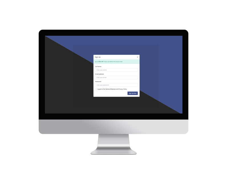
Sign Up Modals
Here is an example of a sweet alert with a community registration field.
